

How to Add Social Media Icons to an Email Signature
Enhance your email signature by adding social media icons. Discover step-by-step instructions to turn every email into a powerful marketing tool.
Making your Instagram profile look good is one of the fastest ways to turn a casual visitor into a follower. A strong visual identity communicates professionalism, signals what your brand is about, and creates a more engaging experience for your audience. This article is your guide to building a visually stunning Instagram feed, covering everything from core aesthetics and grid layouts to consistent editing and on-brand details.
An aesthetic isn't just about pretty pictures, it's the visual language of your brand. It’s the consistent style that tells your story at a glance. Before you post another photo, take a moment to define what you want your profile to feel like.
Your theme is the overall mood and style of your account. It should reflect your personality or brand identity. Are you a high-energy fitness coach? Your theme might be bold and vibrant. Are you a wellness brand focused on calm? A minimalist, earthy theme might fit better. Think about the emotions you want to evoke.
Here are a few popular themes to get you thinking:
Color is one of the most powerful tools for creating a cohesive feed. Sticking to a consistent color palette of 3-5 complementary colors will instantly make your grid look polished and intentional. When choosing your palette, think about your theme. A minimalist feed might use shades of white, beige, and black, while a bold feed might use bright pink, orange, and blue.
When you take photos or create graphics, look for your brand colors. An easy trick is to always have one dominant color from your palette in every single photo. Over time, this harmony of color creates a powerful visual effect.
Your Instagram grid is your digital storefront. While individual posts matter, it’s the overall look of your 9-grid (the first nine photos a user sees) that often convinces someone to hit "follow." Planning how your posts will look next to each other is a game-changer.
Think of your profile as a photo album, not a random camera dump. A well-planned grid creates visual rhythm and makes your content more appealing to browse. It shows that you’re intentional about your content, which builds trust and authority with your audience.
Planning a grid doesn't have to be complicated. Here are a few straightforward layouts you can use to structure your feed:
Your aesthetic and grid layout are just templates. The real impact comes from the quality of your content. You don't need a professional Hollywood-level camera, but putting a little effort into the fundamentals of photography and videography will make a massive difference.
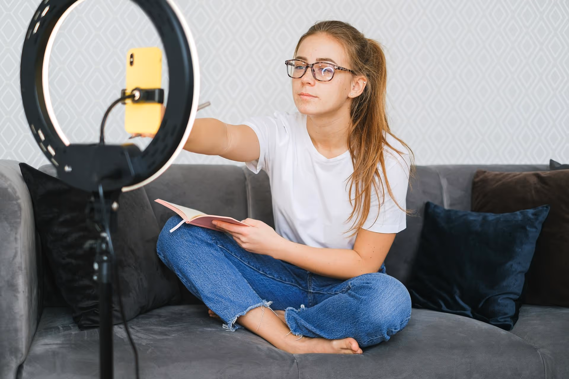
Lighting is the single most important factor in photo and video quality. Grainy, dark, or poorly lit content just doesn't look good. The best light is almost always natural light. Try shooting near a window or outdoors during the "golden hour" - the hour right after sunrise or before sunset when the light is soft, warm, and flattering.
If you must shoot indoors without natural light, invest in a simple ring light or a softbox. This small investment can dramatically improve your content quality by providing consistent, even lighting.
How you frame your subjects can turn a snapshot into a professional-looking photograph. You don't need a degree in art to get this right. Just keep a couple of simple principles in mind:
Consistent editing is what will truly pull your feed together. Editing isn't about making your photos look fake, it’s about refining them to fit your specific aesthetic. Every photo, whether it's a sunny beach shot or a cozy indoor picture, should have a similar tone and feel.
The simplest way to achieve editing consistency is with presets. A preset is a pre-saved set of editing adjustments (like exposure, contrast, temperature, and colors) that you can apply to any photo with a single click. Most modern editing apps, like Adobe Lightroom Mobile (which has a great free version) or VSCO, are built around using and creating presets.
You can create your own preset by editing one photo until you get it perfect and then saving those settings. Or, you can buy presets from professional photographers and creators who have a style you admire. Using the same preset (or a set of similar presets) on every photo is the fastest way to get a professional, unified feed.
Even with presets, you'll often need to make small tweaks to each photo. Focus on these simple adjustments for a polished look:
A beautiful grid will get people's attention, but the finer details of your profile will keep it.
Instagram Story Highlights are a fantastic way to organize valuable information and show off your personality. But the default thumbnail story grabs can look messy. Create custom Highlight covers that use your brand colors, icons, or fonts. This is easily done in an app like Canva. On-brand covers organize your profile and turn your Highlights into a clean navigation bar for visitors.
Your aesthetic shouldn't stop at the grid. Carry your visual branding into your Instagram Stories. Use your brand’s color palette and fonts when adding text or using tools like the drawing pen. You can create simple templates in Canva or even in the Instagram Story editor itself for recurring content like Q&,As, tutorials, or behind-the-scenes segments. Consistency, even in your "in-the-moment" content, strengthens your brand.
Creating a beautiful Instagram profile isn't about perfection, it's about cohesion and intention. By defining your aesthetic, planning your grid, focusing on high-quality visuals, and maintaining consistency in every detail, you build a powerful brand identity that attracts and holds your ideal audience's attention.
Managing all these moving parts, especially planning your grid, is much smoother with the right tools. We built Postbase with a visual content calendar designed for creators and marketers who care about aesthetics. Seeing exactly how your posts will look side-by-side allows you to drag, drop, and reschedule your content until the grid looks perfect. We let you preview your feed before you publish, ensuring that your carefully crafted look stays consistent every time.
Spencer's spent a decade building products at companies like Buffer, UserTesting, and Bump Health. He's spent years in the weeds of social media management—scheduling posts, analyzing performance, coordinating teams. At Postbase, he's building tools to automate the busywork so you can focus on creating great content.

Enhance your email signature by adding social media icons. Discover step-by-step instructions to turn every email into a powerful marketing tool.
Record clear audio for Instagram Reels with this guide. Learn actionable steps to create professional-sounding audio, using just your phone or upgraded gear.
Check your Instagram profile interactions to see what your audience loves. Discover where to find these insights and use them to make smarter content decisions.
Requesting an Instagram username? Learn strategies from trademark claims to negotiation for securing your ideal handle. Get the steps to boost your brand today!
Attract your ideal audience on Instagram with our guide. Discover steps to define, find, and engage followers who buy and believe in your brand.
Activate Instagram Insights to boost your content strategy. Learn how to turn it on, what to analyze, and use data to grow your account effectively.
Wrestling with social media? It doesn’t have to be this hard. Plan your content, schedule posts, respond to comments, and analyze performance — all in one simple, easy-to-use tool.

